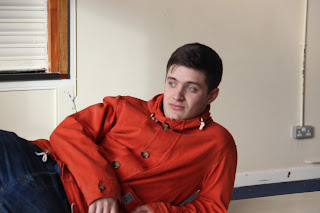
My Photo-shoot
I used this photo on my magazine front cover. I thought this photo was a good choice as the lighting was just the way I wanted and it was a shot from a good distance. The model I thought was a good choice as he is the same age as the target audience of the magazine. The only issue I had with the image really was the background. Because he has dark hair, the dark background was hard to remove from the image. In the end I thought I would use a black background in order to blend it in. The photo is also a bit out of focus. If I could retake the image, i'd use the same sort of lighting but on a white background.
I was going to use this photo as it uses different shots of 3 teenagers. The only reason I didn't use it was I didn't have anywhere to put it. The middle model is out of focus which would have made the magazine look less professional. Although, I think the photo is good because we are all facing the camera but not looking directly at the camera. This means that you can see our faces but it makes it a little less formal. If I had used it, it would have expanded my colour pallet. This is because all the models are wearing different colours; blue, orange and green. That means if it was at the bottom of the cover, I could have used a much wider range of colours.
This photo had few good aspects. The main one is that it's from a good angle and distance. On the other hand, it's out of focus and you can't even fully see his face. This would make it a bad main image which would bring the magazine down. Apart from that, it is a good stance and I think it has the chance to be a good image if it had been taken by a good photographer. Maybe if it had been taken more from the front and the lighting had been improved instead of it being really light on one side and dark on the other.
I was close to using this photo on my cover. It shows youth as a rebelious group and dangerous. I thought this would be a good cover as it shows how different young people can be. Also, because he's the same age as the target audience, they would look at this magazine cover and be interested in reading it. The main reasons I didn't use it is the lighting is pretty bad and he's not pulling the right face for it. If i was going to re-take it for my cover, I would have made him pull an angrier face and maybe take it from a bit of a lower angle. This would get the audience more involved.
This was the only other photo I used on my cover. This was because the model is standing in a good position, not staring into the camera and the lighting is quite good. It also helps that he's dressed like a lot of the target audience and is the same age. The only thing I didn't really like was where he was stood. It would have been much easier if he was stood on a plain white wall without the door next to him. This would make it easier to edit the picture, and place it into the cover with ease. This photo portrays youth as almost sensible. The model is standing up straight and not doing anything wrong.
This has to be the worst photo I had. The distance is completely wrong as it's not really a medium shot of the model. The lighting is off so most of him is dark. He's staring too far past the camera. This makes it harder to connect with the audience. If i was to re-take it but using the same scenario, I would take it from a bit further away and use proper lighting so it's easier to alter. I would also make him pull a different face.


No comments:
Post a Comment